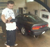
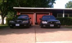
CRX GRL;944 wrote:DEFINITELY the 1st pic in this post! very clean, good angle, enough room to put the logo yet still make it not so tall.
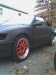
NO OFFENSE TO ANY of the cars in the other 3 pix, eh..not even gonna comment about the 2nd pic.
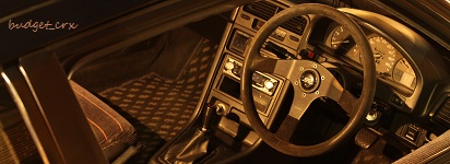
the 3rd pic...the first thing i look at is the stupid lip falling off
4th pic...again too much red and not gonna finish the comments.
I would have to agree, that first pic is gold. now we just need a logo to put on it.
but i think all those can be used to rotate at the top of the page, but the first one is the only one worth putting a logo on and sticking on the front page
This post comes with a guarantee: I guarantee that I don't care what you think about it.
modthesol;901 wrote:i put this together in paint. lol at my crappy ness. but i would rock this sticker on my window. not the white backround but no backround.
a variation on that idea... obviously font can be changed, I'm just screwing around with new ones that I downloaded recently
This post comes with a guarantee: I guarantee that I don't care what you think about it.
SilverStreak02;958 wrote:Ok, my friend got one of the first logos done so here it is. Please give comments and critiques...
My friend can make the background clear to layer onto pictures in Photoshop and can make the logo sharper.
My sister used to be a huge fan of that band... She said it reminds her of HANSON's logo... :dunno:
I'm still a neighborhoodASSHOLE!
SquadronOne.net - 1996.5 Black Acura 3.5RL - Kouki front end conversion coming... Wait. DID IT! - 2004 Carbon Gray Pearl Acura 3.5RL - Slammed, JDM headlights, Navigation, other fun stuff